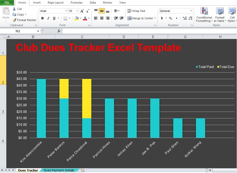
A bar graph template is a diagram that consists of bars of equal widths used to represent data so you can compare among categories. Using bar graph is an effective way to present data in an intellectual and organized way. You can make either vertical or horizontal bar graph.
Moreover, people don’t know how to make a bar graph. It is a quiet easy, you can make it on your own and download a template online. The essential things to keep in mind that these types of graphs have key attribute;
- Bar graph should compare data simply and professionally.
- The relationship of the data should be laid out in the x and y-axes.
- It should enable you to display changes and trends effectively.
Table of Contents
What Is a Bar Graph Template?
A bar graph template is a pre-designed chart layout used to compare numerical values across different categories. It normally includes labeled axes, sample bars, category names, a title area, value markers, and a consistent visual structure.
The bars may appear vertically or horizontally, depending on the purpose of the graph. Each bar represents a specific category, while its height or length shows the value connected to that category.For example, imagine that I want to compare the monthly sales of five products. Rather than drawing the chart manually, I can open a bar graph template and replace the existing data with:
- Product A: 450 units
- Product B: 620 units
- Product C: 380 units
- Product D: 710 units
- Product E: 540 units
As soon as the data is entered, the template displays the differences visually. Product D will have the tallest or longest bar, while Product C will have the shortest.
A template does more than save time. It also helps maintain proper spacing, alignment, proportions, labeling, and visual consistency. This is especially useful for people who are not professional designers but still want their reports and presentations to look organized.
Types of bar graph templates:
Making bar graph template will benefit you a lot for different purposes. For example, teachers use it as an interesting way to teach students. You can ask your children to tally and compare data by using bar graph.
Furthermore, this template can assist you in developing survey skills. They achieve this by enabling you to make the bars according to the information at hand. You can create different types of bar graph templates. Select one that will suit your requirements. You can make the bar graphs for the following;
- Kids
- Charity
- Favorite things
- Population
- Reading
- Sports
- Students
- Weather
Why I Prefer Using a Bar Graph Template
Creating a chart manually may sound simple, but it can become frustrating when I have to adjust bar widths, calculate intervals, align labels, select suitable colors, and maintain consistent spacing.
A bar graph template solves most of these problems before I even begin.
Saves Time
The basic chart structure is already prepared. I only need to enter my values and change the labels. This is much faster than drawing the graph manually.
Makes Data Easier to Understand
People process visual information faster than long paragraphs or numerical tables. A bar graph helps readers identify differences, patterns, and rankings without studying every number individually.
Creates a Professional Appearance
A well-designed bar graph template gives reports, presentations, and documents a polished look. Consistent spacing, readable typography, and balanced proportions make the data appear more credible.
Reduces Design Mistakes
When I create a graph from scratch, I may accidentally use uneven intervals, inconsistent bar sizes, or unclear labels. A template provides a reliable framework that reduces these problems.
It Can Be Reused
Once I customize a template according to my brand, project, or preferred style, I can use it repeatedly. I only need to update the data for each new report.
Works for Many Subjects
A bar graph template can be used in business, education, marketing, healthcare, science, finance, research, and personal planning. It is one of the most versatile visualization formats available.
Which form of bar graph should you use?
Here are the different forms of bar graphs that you can use;
Horizontal or vertical bar graphs
The only difference in this form of bar graph is the horizontal or vertical orientation of the bars. You have to remember one thing while making graphs using these forms. One axis has the categories and the other axis contains the axis. These labels are placed on the basis of the orientation of the bars. However, when you have categories with long names then horizontal bar graphs are handy. While you should use vertical bar graphs when you have a lot of categories to plot.
Stacked bar graphs
If you have to present the answers of sub-groups then use a stacked bar graph. You can divide the categories with these graphs. The bar displays the categories and in a single column, you stack them on top of each other. Therefore, this graph is called a stacked bar graph.
In the case of a horizontal version, you can stack them side by side and the small ones present the sub-groups.
Grouped bar graphs
They are almost similar to stacked bar graphs. But, the grouped bar graphs have separate bars for the sub-categories. It is a lot easier to see them in grouped graphs when you consider comparative sizes. Don’t use such a bar graph if you have several sub-categories.
Consider the nature of the data you want to present while selecting the form of a bar graph to use.
When should you use a bar graph template?
You should use a bar graph when you need to compare different datasets or track trends over time. Simply comparing data against one another is another way of using the bar graph. They are used by many professionals from all industries. During presenting data, they create graphs to support their storytelling and increase understanding. It is the easiest way to present data comparisons visually.
Some tips for creating a bar graph template:
Here are some helpful tips that you should follow to create a bar graph template;
Launch your program
Different programs and software are used to make bar graphs. You can make a basic template and then save the file. This way, you don’t have to keep on creating a template each time you require one. After saving the template file, you can begin customizing your graph.
Find out ideas or templates online
These days, you can search everything online. There are all types of templates from simple templates to complex ones. You can download a template online if you don’t want to make a bar graph. You just have to ensure that you save the file in a secure location.
Input your data
After creating your template, you have to input your data. To place on the x-axis, decide the category or group. After that, think what numerical values or scale to place on the y-axis. You should ensure to include all the labels and the values.
Place your bars
Plot the bars after inputting all the information around the graph. Check your data carefully while making your bars. In order to plot the values accurately do this. Presenting an inaccurate data is the worst thing. Also, you won’t able to provide the readers all the accurate information.
Personalize the colors and fonts
When you have plotted the bars, you can begin customizing your graph. You can customize the colors, styles, and fonts of your graph. According to the theme of the data you’re representing, modify them.
If you want, to make the graph more appealing, you may even add some graphics or images. Don’t forget to save the file as soon as you’re through with your graph. Save your file using a different name for your template. Then, if you want, print out your graph and share it with the right people.
Components of a Bar Graph Template
Before customizing a bar graph template, I like to understand the purpose of each section. A standard graph usually contains the following components.
Graph Title
The title tells readers what the graph represents. It should be specific enough to explain the main subject without being unnecessarily long.
Instead of writing “Sales Graph,” I would use a clearer title such as:
Quarterly Product Sales in 2026
A precise title immediately gives the reader context.
Horizontal Axis
The horizontal axis is also called the x-axis. In a vertical bar graph, it usually displays the categories being compared, such as products, months, departments, locations, or age groups.
Vertical Axis
The vertical axis is known as the y-axis. It usually shows the numerical scale, such as revenue, percentages, scores, quantities, or number of customers.
Bars
The bars are the main visual elements. Their height or length represents the value of each category. They should have equal width and consistent spacing.
Scale
The scale shows how the values are measured. For example, the y-axis may move from 0 to 1,000 in intervals of 100.
The scale must be consistent so that the differences between bars are not misleading.
Category Labels
Each bar needs a label that identifies the category it represents. These labels should be short, readable, and correctly aligned.
Data Labels
Data labels show the exact value of each bar. They may be placed above vertical bars or at the end of horizontal bars.
These labels are helpful when readers need precise values instead of only a visual comparison.
Legend
A legend is needed when multiple data series are displayed. It explains what each color, pattern, or bar group represents.
For a simple graph with only one data series, a legend may not be necessary.
Source Note
If the data comes from a report, survey, government database, or research study, I include a short source note below the graph. This improves credibility and allows readers to verify the information.
Design Tips for a Professional Bar Graph Template
Even accurate data can lose impact if the design is confusing. These design practices help me create better charts.
Keep the Layout Simple
The data should be the main focus. Decorative backgrounds, illustrations, shadows, and patterns can distract readers.
Use Consistent Bar Width
Every bar should have the same width. Different widths may suggest that one category is more important than another.
Maintain Equal Spacing
The space between bars should remain consistent throughout the chart.
Limit the Number of Colors
Too many colors can make the graph look unorganized. One main color with one highlight color is often enough.
Use Color Intentionally
In a standard comparison, I use the same color for all bars. When one value requires attention, I highlight that bar with a contrasting shade.
Choose Readable Fonts
Simple fonts are best for graph titles, labels, and values. Decorative typefaces may look creative but can reduce readability.
Avoid Three-Dimensional Bars
Three-dimensional effects can distort the apparent size of a bar. A flat design is usually more accurate and professional.
Sort the Data When Appropriate
For rankings, I arrange bars from highest to lowest. This helps the audience understand the order immediately.
Chronological categories, such as months, should remain in their natural sequence.
Use Gridlines Sparingly
Light gridlines can help readers estimate values, but dark or excessive lines can compete with the bars.
Leave Enough White Space
White space gives labels and values room to breathe. A crowded chart feels harder to interpret, even when the information is correct.
The benefits of using bar graph templates:
A bar graph has different names like a bar chart, column chart or a multiple column charts. However, whatever name you use, it should serve the same purpose. It is a graph that use bars to present data. Usually, it is used to show comparisons between values. Plot the groups or categories on the horizontal or x-axis and the numerical or quantitative scale on the vertical or y-axis. Let us discuss below the benefits of using such graphs;
Represent data easily
Use a bar graph in order to represent data simply and easily. You can diagrammatically indicate your values and data with the help of this template. These graphs are extensively useful in displaying data that have distinct units.
Additionally, in making comparisons or presenting differences between variables, they are also very useful. Such graphs can be very valuable when you have countable variables, data or facts. The data becomes clearer and more understandable by using them.
Represent frequency
According to research, bar graphs are the most popular method of representing data. They are very useful to represent frequency simply and easily too. You can break down the data to indicate the frequency of each category with bar graphs.
Very easy to make
It is very easy to make and this is an excellent benefit of these graphs. Preparing bar graph template is very easy and then plot the data when you have it. The graph has the title, the scale, and all the labels.
In addition to this, creating this graph generally needs three simple steps. The first one is identifying the groups of values for the axes. The second one is to make the scale that you’ll use to establish the numerical data. In the last step, select the style, color, and settings of your bars.
Widely-used and versatile
We have said above that these graphs are very popular and have different types of bar graph templates you can make. Due to this, you can enjoy its versatility. The bar graph is used for different purposes. Different people and industries use bar graph in different types of settings such as the educational setting, industrial, business, retail, and more.
You can use it to explain comparisons and differences between values. This enables your readers to understand your data.
Conclusion:
In conclusion, a bar graph template is a very useful tool used to present data in in an intellectual and organized way. You can use this graph when you have ranked (ordinal) or demographic (nominal) data. These graphs come in different forms like horizontal or vertical, stacked, and grouped.
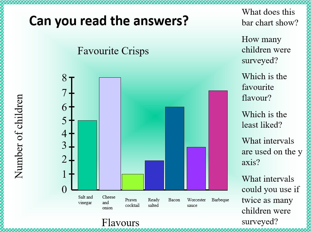
reading bar charts worksheet
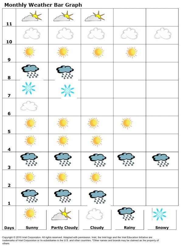
monthly weather bar graph
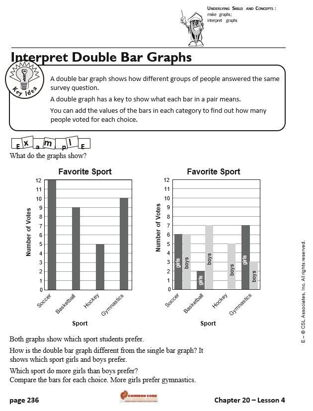
interpret double bar graph template
horizontal bar graph template
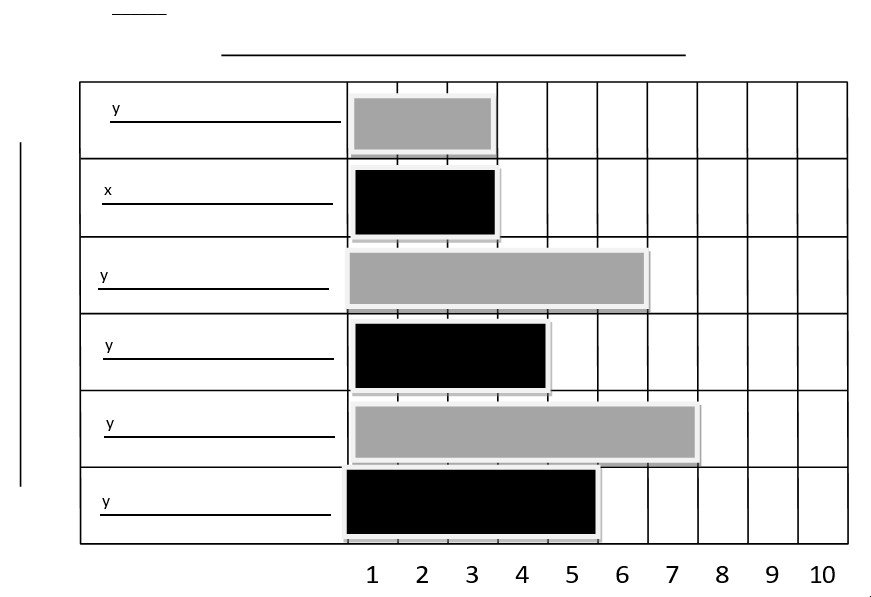
generic bar graph
free printable bar graph template
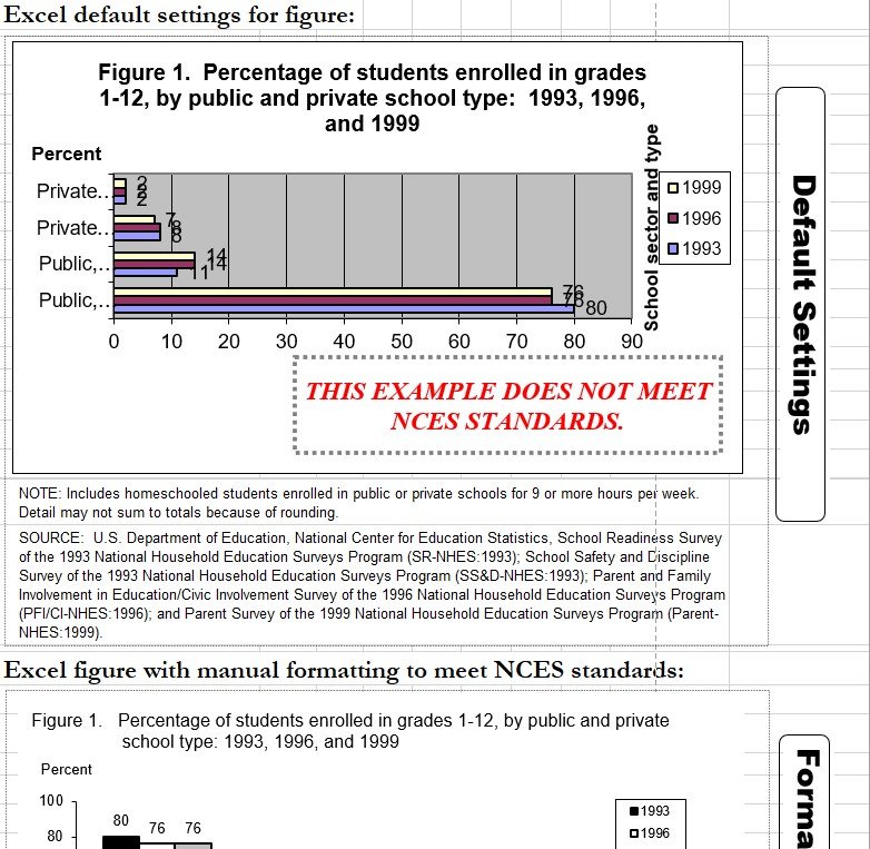
free bar graph template
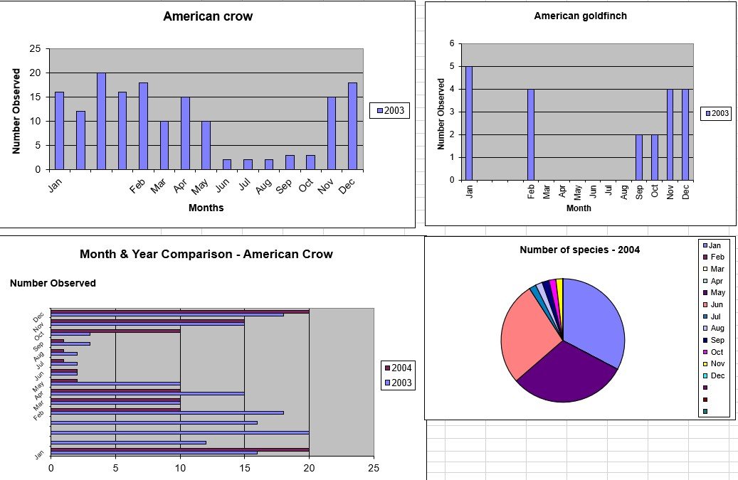
blank bar graph
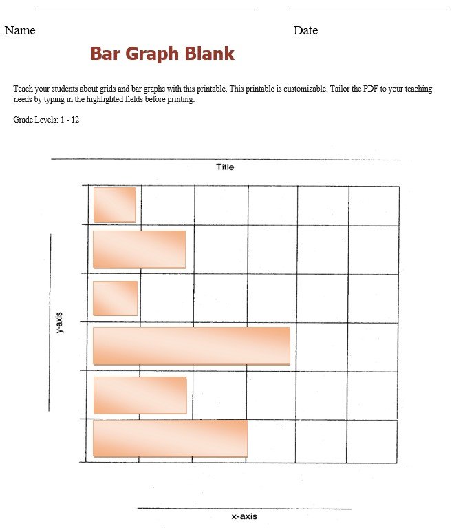
bar graph template
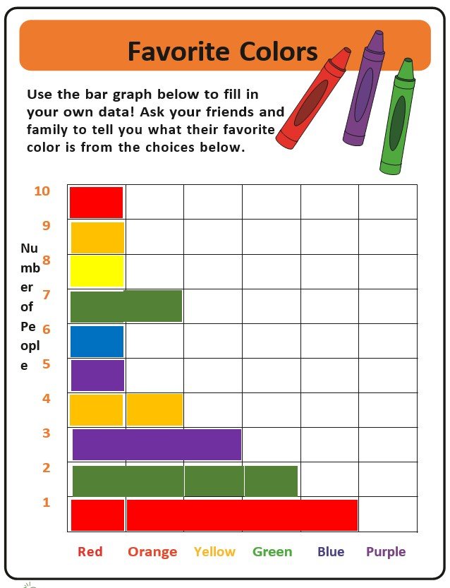
bar graph template powerpoint
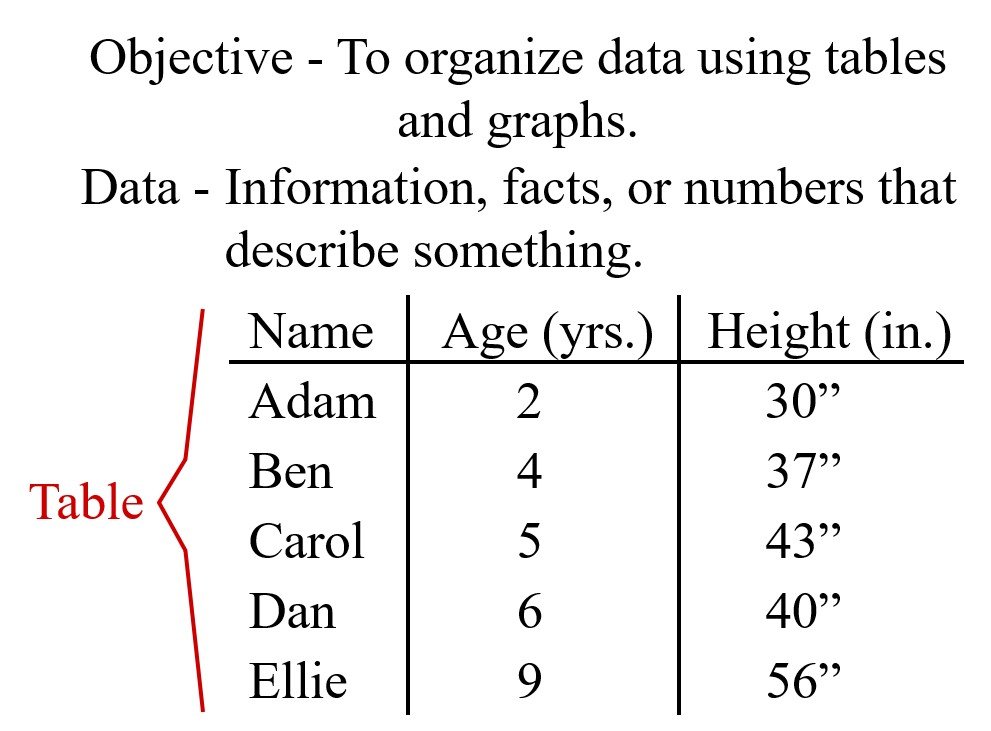
bar graph template excel
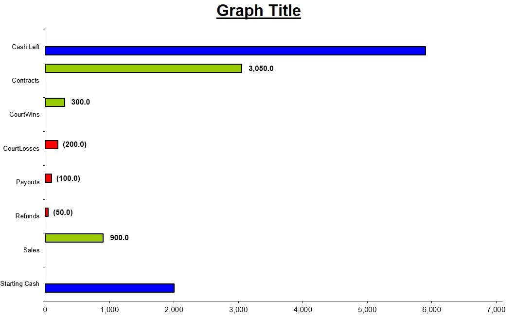
bar graph template editable
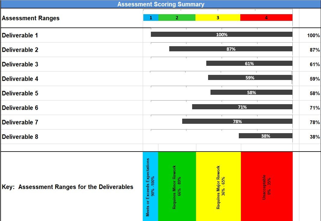
bar graph chart template
FAQ’s:
For what you can use a bar chart?
A bar chart can be used to represent the following;
- Earnings
- Trends
- Cost fluctuations over times
- Distributions
How to create an effective bar graph?
You should keep your bar graph simple so that your data can be easily readable. To measure the data conveniently, ensure that your bars have a square and flat top. The bars should be organized by height so that it shows the hierarchy.
What Is the Main Purpose of a Bar Graph Template?
Its main purpose is to help users compare numerical values across separate categories without building the graph layout from scratch.
Can I Use a Bar Graph Template for Percentages?
Yes. Percentages can be displayed in a standard, grouped, or stacked bar graph. The axis and labels should clearly show the percentage symbol.
What Is the Difference Between a Bar Graph and a Histogram?
A bar graph compares separate categories, and spaces usually appear between the bars. A histogram shows the distribution of continuous numerical data, so the bars normally touch.
Can I Use a Bar Graph Template in a Research Paper?
Yes. A bar graph can present research findings clearly, provided the data is accurate, the axes are labeled, and the source or methodology is properly explained.
You May also Like
 Free Invisalign informed Consent Form (PDF)
 Exploring the Benefits of a Club Dues Tracker Template (Excel)
- Free Demand Letter From an Attorney (Word / PDF)
- Value Chain Analysis Template (Word, PDF)
- How Debit Note Template Excel Format Helps You Having A Clear balance?
- Free Fillable Blank Check Template (Word, PDF)